Still Developing

" A lot of my enjoyment of photography comes from learning. This is typically done through talking with others, reading books, magazine articles, blogs, etc. Part of the balance of having so much good information available (especially the writings that people make available for free online) is to contribute back by writing anything that I learn or experience. If you get something out of this great. If you care to comment to correct my many mistakes, I would greatly appreciate it. Landscape photography can be a lonely occupation but the conversations we have more than make up for that. "

Tuesday
18 August 2009
5 Comments

Minor Ward

I’ve been intrigued by Minor White’s work since seeing his ‘Capitol Reef’ abstract while browsing the Masters of Landscape website (a frustrating website but occasionally useful). This picture is captivating and offers a wonderful example of how a picture can transcend mere representation. The fact that this is just a vein of rock is irrelevant. The picture’s lack of subjective anchor releases your eye to take in the subject as pure shape.

I went to the library in Leeds a few days ago and borrowed ‘Rites & Passages’ and surprised to find one of David Ward’s pictures in it! Ok, it wasn’t really one of his pictures but it was certainly very similar (I’ve included Minor White’s picture to the right and you can see the photo of David’s I refer to here. Now I’m sure this wasn’t intended as a direct homage of Minor but I wonder if the imprint of such a striking photograph was sparked when David was confronted with the subject matter? There are a few other aspects of Minor White’s photography that I find has parallels with David’s (I’m not in any way suggesting that David is a plagiarist by the way). Minor White and David share a love of the abstract and of art philosophy and although David doesn’t share many of Minor’s other proclivities, I’m sure he would admire his art (Actually I know he has a Minor White book and if he is anything like me, I can’t help but be inspired by revelational photography). However this wasn’t really meant to be comparing David Ward with Minor White, it was intended to introduce a wonderful photographer to a wider audience, one who may appreciate his intimate landscapes (just ignore the naked boys and moustachioed men!)

Find more about Minor White you can see more pictures here and here and you can read a little about him here

Click to view full post including 5 Comments

system asset

Sunday
16 August 2009
33 Comments

Aspects of Landscape

Sorry about the leave of absence – a case of Swine flu I think (or man flu more likely). Just before I was incapacitated by self pity, I spent an enjoyable weekend at a certain Mr Cornish’s (yeah I know, name dropping and everything, sorry..). During the weekend we talked about all sorts of photography stuff, as people do, and we came to discuss aspect ratio preferences. I mentioned that I had only really used my 4×5 camera in portrait orientation as I thought it wasn’t just aspect ratio that is important to ‘learn’ but also the orientation, after all it’s about learning to see in a certain way. It wasn’t the first time I’ve been called anal but I think it was meant in a nice way. Anyway we got to talking about what our favourite aspect ratios were and for what reasons. Now I’ve been looking at various pictures for some time trying to work out what other aspect ratios work and as much as I like 4×5 (OK, it’s verging on an obsession) but I don’t think it works particularly well in landscape mode. The other options are 3×2, 2×1 and 6×17 and 16×9

Interlude..

Well lets have a think about what can change compositionally as you move to a landscape orientation. As we move to a landscape orientation, we are both able to spread the transverse movement of the eye so wide, sweeping compositions become possible (as in this ode to Minor White here, this wonderful Lake District composition here this epic Glencoe-scape. Also, compositions that use an off-centre balance become possible (see here, here and here). Wider formats allow more ‘breathing space’ around the composition and allow shallower diagonals, see here. They also allow objects in the landscape to ‘gaze’ (as in the last Dunstaburgh example of Joe’s. Ultra wide is more difficult to categorise – In my (personal) opinion, most ultra wide landscape images tend to be medium landscape images with some extra included either side. There are exceptions though, like Mark Denton’s Durdle Door (see dt0043).

I’ll start with 3×2 with ‘yeah sort of’. I’m not sure if it’s overexposure to this aspect ratio but it always seems to be either too narrow or too wide (mostly too narrow in my mind). Obviously some compositions may work perfectly with this ratio but I don’t seem to see many..

Next in line is the obvious 5×4 landscape format. Now I see more satisfactory compositions in this format but that may be to do with more committed photographers putting up with 6×7 or large format cameras (for the record, 6×7 is nearly 4×5 in aspect ratio, although just slightly fatter 68×55 according to me horseman holder which makes it 4×4.95 or 5×4.04). However for me this is just a little ‘blunt’, squeezed, stunted – perhaps trying too hard to be square? Again, there are some spectacular compositions in 5×4 but they seem to be the exception rather than the rule.

Now we get to what I think is my favourite – 2×1. When I look at 2×1 compositions, things look more balanced and, in a good composition, I tend to look all around the frame. 2×1 breathes, it seems to allow for more creativity in graphical composition. Anyway, personal opinions again, it just seems right. 2×1 is also pretty close to 16:9, the ratio that was chosen as the most like the human gaze by widescreen TV manufacturers, based on enormous amounts of research.

Finally 6×17. Now I used to be impressed by 6×17 shots, taken in by the span and detail. However as time has progressed, the pictures that once blew me away now hold less interest; they don’t hold me eye anymore. This could be because of my warped aesthetic but from what I can tell, this reaction is fairly common (comments welcome please). 6×17 just seems too.. big! Most compositions seem to shout breadth over quality (cue tailoring catchetisms) and very rarely does a composition hold together across the whole frame. Some of the best 6×17 shots I have seen have been ones where the composition could almost be considered as two parts of a story combined together; One composition leading through to another. Mark Denton, Colin Prior and Jaspal Jandu seem to be the main proponents of 6×17 in the UK.

So, where does this lead me? Well as I was talking with Joe about this he suggested I could borrow one of his 6×12 backs and a bunch of 120 film that was nearing expiry. So I think it’s time to start playing with different aspect ratios, starting with 6×12 and possibly trying out the one format I haven’t talked about.. square. I have to say that this is the one format that seems to have a unique status. Square pictures really have to work compositionally; there graphical structure has to work otherwise they fall apart. This ‘challenge’ interests me and although it worried me that I’ll fail completely – I do want to try and I hope I can manage as good a job as our Dav does.

p.s. The picture to the right is from the first proper camera outing I made after I got into photography, August 2005. Obviously I had a fondness for 2×1 from the start :-)

Click to view full post including 33 Comments

system asset

Thursday
6 August 2009
3 Comments

Whay do we ‘Art’?

New Scientist has an article on their website about the 10 Mysteries of you, the strangest things about Humans. One of these things is ‘Why Art?’ and it goes through a few different reasons for why we create art and why we enjoy it.

Darwin was one of the first scientists to posit a driving force for art and likened it to sexual display in birds and other animals. Other researchers thought that being artistic was seen by the tribe as an asset because being artistics goes with being ‘inquisitive’ and being open to new experiences (i.e. being braver) or that a social artistic ‘paradigm’ binds the tribe together. i.e. The tribes identity is reinforced through a shared aesthetic.

It is this last point and a related point to be the most interesting. One of Darwin’s signs of ‘fitness’ was having the excess resources to do something completely useless. e.g. for the Birds of Paradise, cleaning out your ‘showground’ and performing stupid dances is a wonderful way of saying “Look how fit I am, I can do everything I need to stay alive and still have time to dance like a prat!!”. The New Scientist article brough these last couple of things together in order to create an explanation for modern/contemporary art.

Because you have to spend a lot of time learning how to appreciate some of the more eccentric forms of modern art, you are demonstrating how rich you are and hence your social standing. The more time you can spend learning how to behave in the stratospheric society of the contemporary art world, the richer you must be. From a Darwinian point of view, this barrier to entry also forms a social bonding mechanism for the members of the contemporary art’s fraternity. You could also extend this ‘tribal’ society analogy to explain the reasons why the contemporary art fraternity exludes artists and artwork that don’t conform to their social group dynamics. They are basically a tribe of rich idiots 😉

Just a theory 😉

p.s.This tribe thoery may also explain the continuous conversations about technology that some photographers enjoy. They are basically using a shared social structure that allows people to become part of a their tribe. Knowing enough about the technical merits of Canon’s latest optics allows you to join the group, having tested those optics for chromatic abberation yourself gives you enhanced social standing.

Click to view full post including 3 Comments

system asset

Wednesday
5 August 2009
5 Comments

More Scanner v750 Profiling

Ok – since my first attempts to create a profile at the weekend, I’ve continued with Provia. Interestingly, the Provia result that worked out best was the profile that is recommended for Velvia 100, Provia 400 and Astia 100. I can only think that the new Provia 100 is being produced using the same base as Velvia 100 and Astia 100 (which would make a certain amount of sense).

If I use the recommended profile, I end up with a lot more Magenta/Pink colour in the mid to low tones. I tried playing with alternative profiles to pull out some of the shadow detail but for the scans I have made so far, the ‘N’ icc profile (N = Wolf Faust code for astia/provia400/velvia 100) seems to get the full range out. see here for wolf faust codes

I’ve also played around again with Velvia scans and am now happy with the pure Velvia profile and I’ve also generated a new boosted profile that will get more out of the shadows which keeps the colours more accurate. I’ve linked to the N, V and V boost profiles at the bottom of this post.

If you want to see some tests with me using the different profiles against velvia, provia and astia, have a look at the following:-

Budle Bay – Astia and Velvia at Sunset

This was taken on Budle Bay and you can see that the velvia profile scanned Astia is too magenta all through the shadows. The ‘N’ profile scan looks great, a nice subtle colour, quite different from the Velvia which is just a little too magenta for my tastes (but accurate to the transparency).

link to demo page

Dunstaburgh Daylight – Provia, Astia and Velvia

Here you can see that the velvia transparency has boosted the greens and we have quite a magenta cast in the sky wheras the Astia and Provia have clean skies with neutral clouds. Of note is the comparison between the Astia using the Velvia profile and the Astia using the correct profile. To see this different clearly, click on the N astia box and then roll your cursor over the V astia box to see the difference. The Velvia profile adds significant magenta to the astia skies and then muddies up the grass with too much brown. The correct astia profile gives an accurate water and grass colour,

link to demo page

Holy Island Shed – Astia and Velvia

Again the comparison between the Astia using the velvia profile and the correct profile shows the velvia profile adding too much magenta, ruining the grass colour and making for mucky shadows. The correct profile really brings the bleached wood out and the summer grass colour becomes believable. The velvia profile also clips shadows. I’ve included the velvia scan for accurate comparison between the two film types (I trust these scans more than my previous comparison).

link to demo page

Holy Island Rocks – Shadow detail with Velvia and Astia

Oops – I used two different compositions for the two films (actually I didn’t I just scanned the wrong trannies) anyway – they’re close enough to show the information.

Again, the improvement in the rendering of the Astia scan using the correct profile is amazing. I’m beginning to like the film again :-) shame that it’s so hard to get hold of. For shots like this though, the cool blue shadows and the richer greens make Velvia an obvious choice.

link to demo page

Saltwick Nab – Provia

This is the transparency I used to match up the provia profile. I had used the Velvia profile on the pictures in my gallery where the additional magenta looked quite nice but it wasn’t what was on the transparency. When I used the Wolf Faust ‘N’ profile I got very accurate results.

link to demo page

Hodge Quarry – Velvia and Astia

The shadows on this Peak Imaging development are more intense than the base shadow in my Velvia profile and hence were blocking up (although the colours were spot on). So I made a subtle curve to darken the scan of the target (in Lab) to try and trick EZColor profile generator to create a profile that would pull some more detail out of transparencies. This was a tricky balance – make it too dark and you just get noise in your final scan. Alter the contrast too much and your colour gets inaccurate. I finally found a happy medium.

Click on ‘V velvia’ (the standard scan) and then roll over ‘V pull dark’ and have a look at the black cave on the middle right of the picture. The pull dark profile gets quite a bit more out of the shadows.

link to demo page

And the profiles!

Velvia Profile

Boost Shadows Velvia Profile

Provia/Astia Profile

You can download all of the pictures to look at in a program of your choice by clicking here

I’ve added a comparison of the raw velvia profile on that quarry cave compared with the boosted profile in the sidebar.

UPDATE: I should add a note here that Ian Scovell was very kind in spending some time on the phone with me over the last couple of days to talk through my ideas about the need for different profiles and also general background about scanning – Thanks Ian – if you want to leave all this complexity to the experts, Ian makes some of the best professional scans you will find in the UK. They are so good I will happily pay the £12 per scan for full service including cleaning and spotting

Click to view full post including 5 Comments

system asset

Monday
3 August 2009
2 Comments

Shadow Boosting ICC Profiles

I ordered some Wolf Faust (link) profile targets for Velvia, Provia and Astia last week and got a chance to play with them over the weekend. The reason for ordering the targets was primarily to ascertain if there was a problem with me scanning Astia film (as it had been suggested I needed a correct target otherwise there would be potential colour casts) but to begin with I wanted to see what improvements I might get from using the Velvia and Provia targets. First of all you should know that I use EZColor for profile generation and Silverfast for scanning. The process for making a scan is

  1. Set the scanner so that it is doing no adjustments and is applying no colour profiles.

  2. Scan the target profile and save as a TIFF file (I’m sure you can use other formats but TIFF seems as close to RAW as I could manage).

  3. Start EZColor and read in the TIFF and the data file which will create your icc profile

Now following this procedure, I scanned a picture that I knew was challenging and compared it with both my original scan from an EZColor IT8 target and with the original transparency. The colours were good, very good. However the shadows were very blocked up. I tried for some time to find a profile editor so I could tweak the curves but to no avail.

However, I then had a seemingly obvious idea (aren’t they all obvious by the time you’ve had them). The reason that the shadows were blocking up is that the IT8 target I had scanned created a profile that mapped rgb 10,10,10 to pure black. All I needed to do was to adjust my scanned IT8 to tell the scanner that only black should be mapped to black. I did this by overwriting the black patches on the TIFF I had scanned in with pure black. I tested this and lo and behold (and other cliches) I had a scan with great colours and full depth in the blacks. The blacks were noisy but all of the data was in there. Because of this I have the choose of clipping then again (as in the original icc) rolling them off to black with curves or using shadow highlight to recover some shadows before clipping. Overall they’re the best scans I’ve had out of the v750.

I did have one slight hiccup in that nice story. The first scans I got out of the velvia scan was of a bright saturated sunset and I original chose ‘relative colorimetric’ from the intent drop down in the scanner when making my transparency scan. The result was nice colours apart from the area around the sun which had turned into a great big fried egg. The area around the sun had ended up almost a pure yellowy orange. This puzzled me for a bit until I read about what the different intents actually do. To understand what they are for, we first need to understand a bit about ‘gamuts’. Basically, when you have an icc profile, it tells the computer what the maximum bounds of a colour are. For instance, the red channel will say “when we have a 255 in the red channel, the red is this colour” However, if you’ve got an original scan that has colours outside of the gamut, you need to have a strategy to know what to do with them. Perceptual intent says to compress all of the colours close the gamut edge so that their relationships are mostly preserved but colours are changed. The other is to make all colours accurate but clip the colours that exceed the gamut. Perceptual is the first (munging) and relative colorimetric is the second (clipping). So my solution was to just change to perceptual and ‘lo and behold’!

Finally create a profile for my provia pictures in the same way. My ‘lo and beholding’ ration was well and truly out though. The shadows had a significant magenta/brown cast. I played around with this for sometime but in the end gave the Velvia profile a go. The results surprised me in their veracity and colour accuracy in the shadows. So .. everything simple then. Just use my boosted icc profile for everything!

I’ve attached a link to it here and I’d be interested in how you find it (if you have an epson v750 that is)..

Click to view full post including 2 Comments

system asset

Friday
31 July 2009
6 Comments

Exhibition at Southwell

I’ve just come back from the opening night of an exhibition at Southwell Minster (near Nottingham) called ‘Masters of Vision’ (*1). On show were pictures by a range of landscape photographers including the ‘doyen’ of British landscape photography, Charlie Waite (OK – I didn’t call him that but google does). If it was only Charlie Waite, the exhibition would have been worth visiting but what makes it an essential visit is that it includes the work of some ‘up and coming’ (read not really well known) photographers, Dav Thomas, Pete Bridgwood, Damien Demolder (editor of Amateur Photographic), Mark Gould, Jonathan Horrocks and Chris Upton.

All of these photographers demonstrate a talent that brings people into the landscape but I’ll try and summarise some of their unique traits (these reviews are of both the show pictures but also their website pictures – in Chris Upton’s case he’s sending me thumbnail pictures from his exhibition portfolio as I’ve based his review mostly on his website)..

Pete Bridgewood

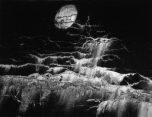
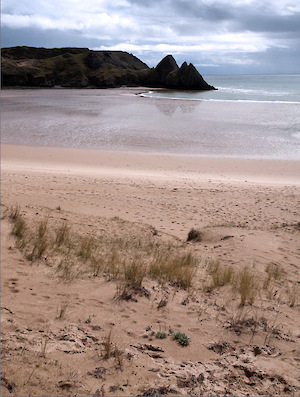
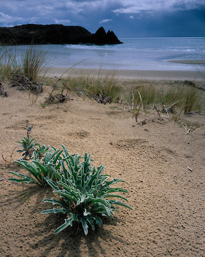
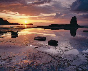
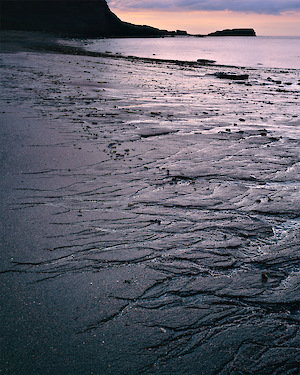
Pete’s work has a association with light that is evident across the majority of his work. He tries (and succeeds) to capture the transformation of the landscape through the kinds of light only seen very occasionally and usually only by someone who dedicates a large part of their life to standing out in the wilderness. His ‘wide view’ photography lets the subject act as foil to the light and and is often seen silhouetted. Where he does take more intimate photographs, colour becomes prominent. My particular favourites of Peter’s photographs are his ‘chiarascuro’ landscapes and also his more recent high key beach shots.

Damien Demolder

Damien has a wide ranging repertoire that is unsurprising for a photographer involved in the photo press. Although his tastes range for street to architectural photography, he does seem to have a unique style in his landscape photography. Some of the pictures exhibited show a colour and mood that I find very beguiling. He combines the ‘impressionstic’ long exposure sweeps we’ve seen done to great effect by Ted Leeming but also captures these same effects in photographs seemingly taken at the edge of storms, where warm diffuse light combine with a foreboding atmosphere. He also admits to owning a whole plate Gandolfi large format camera so he gets bonus points from me.

Jonathan Horrocks

Jonathan’s work has appeared in quite a few publications before now and although his photography covers many of the popular themes in modern landscape photography, it seems he enjoys working on the coast predominantly however, for me his best pictures are when he is capturing the more subtle details of the landscape; Bullrushes in frost; Thistes in a Sunset; The lichen on a stone wall; an abandoned truck.

Mark Gould

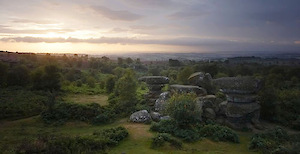
Mark Gould works in a great American landscape mode, one whose foundations stretch back through through the Meunch family back to Ansel Adams. He does work in the UK also and it’s when he does that I find things more interesting. For example, there is a photograph in the exhibition of a old dead root, probably on Rannoch Moor (near loch Ba if I remember tnat root) that has a look that is beyond mere replication or homage. I’d love to see more of his British work.

Chris Upton

Chris Upton’s genre is definitely travel photography and 50% of the images on display conform to our expectations for this genre (e.g. that Venice bobbing boat shots, the Gondola prow, the Zabriskie contours, the stock take on Tunnel View). However when he tackles the less familier (the San Polo bridge and Punta San Vigilio) things get better. What I missed from my previous part of the review was the Harris shots which although to me don’t have the depth of composition that I prefer, at least don’t conform to an expectation. They definitely have a consistency of approach and I think probably contain more of Chris than his stock takes of travel locations. I made reference to trees in my previous, glib review and want to return to them for a moment here. Despite my disparaging opinion of the tree portrait, Chris has a particular flair for it (check out his website). The views of lime tree avenues and autumn leaves have a relaxed composition that I can understand and enjoy – Now if he went to Harris and found some trees …

Dav Thomas

There are a handful of photographers whose work regularly pushes me to think more about my photography, whose pictures work compositionally and emotionally and who have something unique about their vision. One of these people is Dav Thomas (*2) a photographer who lives in Sheffield and works in the Peak District and beyond. Dav works with large format and medium format film (Chamonix and Hassleblad) and also 35mm digital (Sony A900) but with all of these mediums he brings a vision that actively shuns cliche. His background as a designer must help his more graphic compositions but he also has an eye for balance and texture that goes beyond simple design (e.g. my favourite of Dav’s). The interesting thing about Dav is that he is only just beginning to explore his vision. Keep an eye on this one. Oh, and in case Dav is listening, you can still produce ABtastic cheesiness at times so no resting on laurels!

Charlie Waite

Charlie has an enormous back catalogue of stunning work to contend with and I think he sometimes find this a little foreboding (Who worse to compete with than your younger, more energetic self). However, having chatted with Charlie it seems like he’s out and about again, shooting pictures and enjoying the art of photography once again (I have a feeling he’d retreated from photography for a time). I hope that this display of some of his more famous pictures marks a new start and I’ll try to get him to send some of his new work so we can see where he’s heading.

So in summary, get to this exhibition. Go and see some other photographers prints rather than just browsing their websites. The exhibition is open for the next month and if you get down on the 13th of August you can see a talk by Charlie Waite.

Overall I really enjoyed the exhibition. I got to talk to some photographers I’ve known online for sometime but have never met (Hi Doug Chinnery!) and most importantly I’ve been inspired to get out more and get some pictures (especially as I’ve just received a new 5Dmk2 to play with!).

Big thanks to everyone at the exhibition and to Southwell Minster(*3) for allowing the use of their amazing location.

1) Slightly overblown name but given the quality of work on show, we’ll forgive them.

2) The others include people like Neil Bryce (http://www.flickr.com/photos/26431065@N07/) and Melanie Foster (http://www.melaniefoster.co.uk). See my links page for more..

3) You should go just to look around Southwell Minster too! Stunning Normal architecture.

Click to view full post including 6 Comments

system asset

Tuesday
28 July 2009
5 Comments

Why Different Scanning Targets

Ever since I started using my v750 scanner I had read about the use of different types of profiling target and there has always been something that I couldn’t quite understand. Why do we need different profile for different film types?

Originally when I bought my scanner, it came with a Monaco EZColor target which (I beleive) is on a Velvia transparency. Now I originally presumed that the transparency had a bunch of colour targets which were measured accurately and that when I scanned them in I would get a set of ‘adjustments’ to compensate for any colour shifts in my scanner sensor.

However, I then started to hear about different targets for different films and started to doubt my understanding of how the profile targets worked. Why would we need different film bases if the colours of each patch was measured from the actual transparency itself? Surely a standard blue measured from Velvia would be the same as a standard blue measured off Provia. Just to reiterate, profiling targets as I understood them were exposed in order to create the same final colour on the transparency – they are not photos taken of standard colour targets. However, I started to wonder if they were equivalent to photos of gretag macbeth targets.. Why else would you need different ones for different films.

The clue was in the types of target available though. Wolf Faust, a manufacturer of affordable targets, sells a Velvia target and also a target that works for both Astia and Velvia 100. Well obviously Astia and Velvia 100 are very different in colour palette so there must be something else going on.

After some digging around, I found a couple of articles on metamerism in transparency film. Now metamerism is something that you may have heard of in relation to inkjet prints. Some older print colours change colour value under different types of light. For instance, A flourescent light, although it may look ‘white’ is actually has very sharp spikes in it’s frequency curve. If you look at the picture to the right, you can see the flourescent has big spikes in the blue and
another big spike in the yellow. This big spike, if it matches some of the chemicals in the film dyes, can cause those dyes to emit more light (or absorb more light). Hence you may see a boost in a certain colour component under flourescent light. This was the clue I needed, and with a little further digging I found confirmation (albeit scattered around the web).

So, hopefully I can describe it to you.. The key thing to understand is that the dyes used in film display some limited form of metamerism, as described above; They shift colour slightly under different types of lighting.

So for different types of scanner light source you may find that the dyes in your film cause a colour shift. So, LED or flourescent lights may cause the red dyes in Velvia type film to emit magenta light(1) whereas a well calibrated light source would give more accurate colours.

So now we can understand why one profile may work for Astia and Velvia 100. Although these two films produce different colour palettes, the dyes used in the films are fundamentally the same(2).

This is probably why the making of colour profiles is so difficult. You need to have perfect light sources and also a very accurate specrometer in order to get ‘baseline’ readings from film targets.

I had a fairly long email and phone conversation with Ian Scovell (who operates probably the best set up and managed Imacon in the country!) and we agreed that this sounds about the best explanation we can come up with for the differences.

I hope this helps and if anybody has any experiences with scanning targets that can add to the discussion, please add a comment below!

(1) This is just a guess by the way – it may not be the direct cause of magenta colour in scans of velvia although it sounds plausible.

(2) The different colours are probably due to different levels of couplers

UPDATE: My talk about emitting and excitation, while theoretically possible, is most likeley only a minimal cause. On further thinking about the problem, colour changes in detected light for different dyes can be simply explained by the interaction of the light source spectrum with the dye absorption spectrum. I’ll try to find more info about this and add further notes..

Click to view full post including 5 Comments

system asset

Tuesday
21 July 2009
4 Comments

The Photograph is Somewhere

I was recently going through some old pictures and saw a ‘note’ picture taken whilst on a large format course. I was really surprised to see what the actual place looked like as my memory is now aligned with the picture that I took at the time. This really drove home to me how the opportunities in a location are not always obvious. In this case, I’m surprised I even tried to get a photograph with the state of the beach as it was (OK some of the sand mess in the foreground is mine). Bonus points to who can find the final shot in my gallery and I’d be interested in any comments on your reaction.

UPDATE: Well spotted by Gordon (OK it wasn’t too difficult). I’ve added the image to the right hand side underneath my ‘sketch’ image. I applied almost no potatoshop changes to this..

Click to view full post including 4 Comments

system asset system asset

Sunday
19 July 2009
4 Comments

Grad Filters – Singh Ray vs Lee? What colour cast?

One of the key ingredients of landscape photography is exposure control. Graduated filters allow broad level compensation for bright skies, gradiated light across a scene, etc. Many people start by using Cokin graduated filters, which are notoriously non-neutral. The two ‘recommended’ brands, according to weight of opinion, are Lee and Singh Ray. Lee definitely have the larger market in the UK wheras Singh Ray are popular in the US (and can only be ordered from the US directly).

I recently took a photograph at Saltwick Nab and was tempted to use a Singh Ray 0.9 reverse grad (dark stripe in middle, lightening to 0.6 at top of filter) but when I saw the back of my digital camera, there appeared to be a colour shift. I decided to use a Lee 0.9H. I was worried about the colour and when somebody asked why I hadn’t use a reverse grad, I though it worth checking.

I put the grads up against my monitor and then made a visual match against the grad colour which gave the result below (I’ve added a neutral band next to each grad for comparison).

system asset

The Singh Ray definitely have a blue/green tinge and the Lee a less saturated yellow/red tinge. My Lee 0.6H was very neutral in comparison.. It’s also worth noting that the Singh Ray 1.2 hard grad has an gradiation across the supposedly solid bit that is about 2/3 of a stop.

Conclusions? Well, the Singh ray aren’t quite as bad as I though but I think the problem was exasperated by the Lee 0.9 tending toward a yellow whereas the 0.9Rev tends toward the green. I think I will have to try an A/B test against the Singh Ray reverse and the Lee 0.9H. The 1.2H will be going back to Singh Ray to see what happens..

UPDATE: I took a picture of my grads on my light table which is 5500K and got the following

grads

Checking the above on my light table, the only neutral grad I have is the 0.6H from Lee.. The rest of the grads from Lee are pretty close but all very slightly warm (measuring 2 points of saturation for every stop of filtration). The Singh Ray grads were well out though. They were both tending towards a strong Cyan cast with the 1.2H measuring 7 points of saturation from every stop of filtration (for a total of 28 points in photoshop HSB). The 0.9Rev was a little better with 6 points of saturation for every stop but the colour varied from cyan at the 9 end to green at the 6 end.. I will still try these out with film, especially now I now what the cast is so that I can make an appropriate correction if necessary.

Click to view full post including 4 Comments

system asset

Wednesday
15 July 2009
8 Comments

Fuji Velvia and Astia Developing Labs and My Saltwick Landscape

I’ve received my first batch of results from the developers (at least from the Darkroom and NPS Media). The first interesting result is that the Velvia transparencies of the Quarry look different, with NPS Media’s result being clearer, deeper blacks whereas the Darkroom’s had a slight cyan cast.. The subject was, with hindsight, not the best – although with a lot of green it does make for an interesting ‘believability’ check (we disbelieve incorrect green colours more than we disbelieve other colours, supposedly – personally I have a problem with sky blues if they are slightly out). I’ll post more when I get Peak Imaging’s back.

I’m also a little dissapointed in my metering on the Saltwick shoot. I tried to do all of the metering calculations in my head rather than using my checklist and ended up screwing up one exposure and underexposing a couple of others.. Back to using the checklist for me then…

However, all was not lost. My ‘picture postcard’ shot came out a lot better than I though it would. I was trying to use the lines of seaweed in the slate to create some recession in the foreground combined with the three rocks forming a similar line. The results work I think, and hopefully raise something that is pretty obvious to something with a modicum of interest beyond ‘ooh pretty!’. My other shot was one I wanted to take when I was here previously. The sand at Saltwick, as well as being a fantastic red colour, is also quite large grained and this causes some amazing rivulets to form as the water passes through it. I tried to combine this foreground with the feel of a few Icelandic shots I’ve seen recently (silhouetted coastline shapes similar to Josef Hoflehner)..

I’ve sent back some transparencies with some drastic pushing and pulling (+1 Velvia, -1 Provia) so we’ll see what happens..

UPDATE: I’ve got some trannies back from Peak Imaging and was quite surprised to find them a lot better than either NPS or The Darkroom. I’ve put together a ‘rollover’ image swapping demo – hopefully it will work in your browser… click here for astia comparison and here for velvia comparison

Click to view full post including 8 Comments

system asset

system asset