Still Developing

" A lot of my enjoyment of photography comes from learning. This is typically done through talking with others, reading books, magazine articles, blogs, etc. Part of the balance of having so much good information available (especially the writings that people make available for free online) is to contribute back by writing anything that I learn or experience. If you get something out of this great. If you care to comment to correct my many mistakes, I would greatly appreciate it. Landscape photography can be a lonely occupation but the conversations we have more than make up for that. "

Monday
21 December 2009
18 Comments

Quickloads Discontinued

Fuji have a christmas surprise for large format photographers everywhere with the declaration that they are to discontinue production of QuickLoad film from April 2010.

The British Journal of Photography website says:

BJP has learnt that Fujifilm plans to discontinue its Quickload film products next year.

The 4×5 film holders, beloved of large format landscape photographers, will cease manufacture in April 2010, though stocks are expected to last until the end of the year in the UK.

Designed for use ‘where carrying many double-dark slides could be either inconvenient or impossible’, they hold the 4×5 film in light-tight envelopes that can be loaded into a special holder in daylight, and which are less bulky than a dark-slide loaded with film.

BJP understands that its Acros Quickload products were discontinued earlier this year, and that its Velvia 50 versions have been in very short supply.

Fujifilm UK will continue to sell Quickload versions of Pro 160S, Provia 100F, Velvia 100 and Velvia 50 while stocks are in supply.

A spokeman for the firm in the UK described it as ‘an end of an era’.

Hopefully this has no implications for the production of 4×5 film itself (although all bets are off I imagine).

My worry over the sheet film is based on the fact that Fuji say QL discontinuation is based on lack of sales and my observation that nearly everyone I know who shoots colour films uses quickload. This must mean that colour film sales are low also?

For those interested in the weight implications, a set of three double dark slides is approx 500g wheras a quickload holder is 350g and six sheets of QL film is 150g.. So if you are carrying six sheets of film only, there is no difference in weight.

If you carry twelve sheets of film, the weight for DDS is now 1kg whereas it is 650g for quickloads. Not too much of a difference really.

However if you want to get out and about with 18 sheets of film, your DDS package would weight 1.5Kg whereas your quickload equivalent would be 800g.

I don’t know many walks where I’ve taken more than 10 sheets (and most of the times I have done so are when I’ve taken multiple exposures). Even if you do want to take 18 sheets of film, the extra 700g is hardly onerous.

My recommendation would be – stop taking B sheets and get it right first time 😉 (ok, glib comment, sorry)

Click to view full post including 18 Comments

.

Thursday
10 December 2009
14 Comments

Sheet Film and the Dreaded Grafmatic

When I had just started photography I was down in Rock, Cornwall and bought a copy of ‘End of the Land’ by Andrew Nadolski. Many things impressed me about this book (I’ll try to review it soon) but one of the things that continued to impress me with this and a few other books since is the rendering of the film used. I had no idea at the time but since then I’ve discovered that it is probably Kodak Portra 160NC or 160VC. More recently, just as I was starting large format photography, I saw the Harry Cory Wright book, which despite my confusion as to what it was trying to be, I was again captivated buy the quality of colour. As I have used Provia and Velvia since and understood it’s behaviours, I’ve realised that in certain circumstances the muted, warm colours of Portra can allow the subject matter to shine through (especially when there is already significant colour in the picture or a wish to create more muted colours).

If you’ve been following my journey into film, you’ll have also noticed me using Fuji Astia, which has a similar colour response to negative film but which has the benefit of being easy to interpret wheras with colour negative film you need to remove the orange cast, which is pretty much impossible to do in a way that is repeatable. This means that with negative film, you never quite know whether your conversion is accurate or not. I’ve also played with Fuji 160S for quite a while and have never been really happy with it; the results have always tended to a strange green or magenta tinge which I have never managed to remove.

I finally decided it would be a good idea to try out some Portra after all I had heard and, as you can’t buy it in quickload format, I had to decide how to use it which really means either double dark slides or the ‘mythical’ graflex grafmatic film holders; A beast that is rumoured to eat film stock raw and spit out the results in a hail of celluloid confetti. Fortunatley I had a friend who was a well know grafmatic tamer who had managed to build up a coterie of over ten of the beasties and had yet to be bitten by one. So when I saw a couple of mint condition ones come up on ebay for £50 each, I crossed my fingers and pressed the ‘buy it now’ button.

For those of you who don’t know what a grafmatic really is, I’ll try to give a quick review. Each grafmatic has six ‘septums’ within, each of which is a flat peice of light metal the same size as a sheet of 4×5 film with a lip folde at the top and sides to keep a sheet of film in. Once a film is slipped into this sheet, simple tension (and I think a slight curve of the crease at the bottom) holds the sheets in. The container for these septums is a sprung container that when operated (lifted up fully and reinserted) moves a septum to the front of the cue, and then the darkslide reveals the film. The next operation moves this sheet to the back of the container, increments a mechanical counter and the whole unit is then ready for the next shot. For a better guide to what is going on, have a look here and

So, combined with the purchase of 50 sheets of Kodak Portra 160VC and a Harrison film changing tent, I was ready to go. I took a few shots in Scotland (as I’ve shown in my previous post here ). The results were initially dissapointing when I use Silverfast to scan the film. Silverfast’s NegaFix has a couple of problems as far as I’m concerned. The main problem is that it just doesn’t do a great job (in my opinion). The second is that, if you don’t get a a good result, you have to rescan the film. What a pain! The revelation was when I found ColorNeg, a Photoshop plugin by CF-Systems. The key to ColorNeg is that you make a ‘linear scan’, which is basically as close to a scan raw file as you can manage (instructions for the v750 using Epson software are here) then you take the 16bit scan you have produced (which look a loveley orange colour) and firstly process it using Scantique (comes with ColorNeg) which removes the gamma curve from the film to finally produce a ‘flat/raw scan’.

The ColorNeg plugin itself is fairly complicated and not the most user friendly but the default settings produce results that are miles better than Silverfast. I’ve also processed 160S which, despite the scans being a lot better than those using Silverfast, the results are nowhere near as nice as Portra (at the moment I hasten to add – I’ll still carry on with it as I would like to make an A/B comparison). The colours with Portra appear more ‘stable’ and respond well to adjustment in photoshop.

This post is about the film holders though. Grafmatics, if in reasonable condition, don’t eat filml They’ve been simple to use and the only problem so far has been keeping a track of which exposures are which (not too much of an issue as the film stays in the same order and as long as you try loading and unloading in the light – with ‘used’ film obviously – keep a few of those quickloads where you forget to close the lens first. I you’re like me you should get 6 of these fairly quickly :-) )

Next time I take a shot with my grafmatics, I’ll make a little video to show it off. Hopefully that will be this weekend as I’m up in the Peak District with Dav Thomas to research a location for a weekend large format introduction course we’re planning (well everyone else is so why not – so if you are interested in learning a little from a certified large format geek, just let me know).

Click to view full post including 14 Comments

system asset

Monday
7 December 2009
4 Comments

Light and Land – Landscape Photography Discovery Day

This weekend, apart from being my 10th wedding anniversary, was also the Light & Land Discovery Day. This is a yearly dip into the world of landscape photography workshops supplied by Charlie Waite’s company and ably run by Jenny and David Ward. As I had a part to play in this years affairs (which I’ll come back to in a moment) I travelled down to Reading on the Friday night with Charlotte and whilst she was visiting friends in London, I spent the day chatting about photogrpahy with a few of light and lands leaders (Adrian Beasley, Giles Stokoe, Ben Osbourne, Nick Jenkins & Peter Hendrie). The conversation was particularly interesting when talking about the role of video in stills photography and how an understanding of cinematographic techniques can be transferable – in particular when used in portfolios of picture where the order in which they are read can be controlled to some extent. I was surprised that such discussion wasn’t dismissed by other photographers as ‘not our place’ and was pleased at the open attitude that everybody had. I’m still playing with all of this but it’s good to know I’m not going to be immediatly shunned for doing so :-)

I had my alcohol allowance for the year at dinner where I shared a table with David Ward and his wife Jenny along with large format photographers Anna Booth and also Phil Staff (who is a recent convert to the ‘dark slide’) and Eddie Ephraum. Far from being a hub of philosphical discussion, the evening tended toward water pistols & horns (both literal sort and also many a double entendre).

The Sunday was the discovery day itself where a variety of trade stands (Canon, Epson, Paramo, Daymen) and talks took place. The highlight of the talks were David Ward’s “Slow Photography” and a group discussion between Joe, David and Charlie who were critiquing a set of each others pictures taken with point and shoot cameras. The interesting thing about this excercise was the ease in which it was possible to guess who’s photograph was whos, even when Charlie took abstracts, Joe took Cornish detail shots and David took Tuscan landscapes. The attention and focus of composition and, to an extent, subject choice immediatly indicated the attitude and identity of the photographer.

Charlie finished with an announcement that my secret project will be launching in February and so I can finally reveal half of the work that has been keeping me from taking photographs recently. The new Light and Land site has been cooking away properly over the last eight months in my spare (!) time and was at a stage to show a few people and get some feedback. I think it is one of the nicer website designs I have made and is doing some particularly clever (i.e. convoluted and scary) things to keep everything up to date from Light & Land’s master database. The result should be a lot more user friendly and search engine friendly and also will finally provide the opportunity for clients to keep in touch with each other after a course without having to hassle the tour leaders for email addresses. I’ve included a screenshot of a couple of pages on the right hand side of this post so you can see what it looks like. The last steps (payment integration, clients uploading pictures and testing) is going to happen over the next six weeks. If you are interested in helping test it (which would be really useful for me) please let me know.

I still have a coupe more websits to launch (the main one of which is mostly finished and just awaiting client sign off) and after that I’ll be starting my own personal project in the new year hopefully to launch in May of next year! More about that nearer the time.

Finally just a big thanks to David and Jenny Ward for organising such a fun event. Next year can you make it a bit further north though! :-)

Click to view full post including 4 Comments

system asset system asset system asset system asset system asset system asset system asset

Friday
4 December 2009
36 Comments

Joe Cornish talks about Peter Dombrovskis

One of the reasons I upgraded to the Canon 5Dmk2 (apart from very nice screen on the back and a couple of extra pixels) was to start creating some video content. I’ve already posted a couple of sample videos on developing your own colour transparencies and also a practise run creating content in the field which let me get used to the technology (including Final Cut Pro to post process the video). Now that I’m experienced enough not to embarras myself I wanted to record an interview with another landscape photographer. And what better photographer to start with than Joe Cornish, one of mine and many others primary influences. I was visiting Joe to talk about another project and we agreed it would be interesting to see what we could do. So, here is the results of our first test. The edits are a bit rough and ready and I have learned a lot whilst setting this up. I think the content and Joe’s delivery more than makes up for the recording quality. Don’t forget you can click on the ‘HD’ button to get better quality and you can also click on the icon at the bottom right of the video to view it full screen. I hope you enjoy it as much as I enjoyed making it and if you have any suggestions for topics or photographers you would like to see included in the future, please let me know.

A big thanks for Joe for woking with me on this. If all goes well we will do this more often.

Click to view full post including 36 Comments

.

Tuesday
1 December 2009
2 Comments

The Last of the Landscape Films

In the world of colour large format photography, there is a general undercurrent of fear about the discontinuation of certain film stocks, particularly fuji velvia which has already been discontinued in one form; so when Robert White told a colleague that Fuji UK were making there last import of Fuji Velvia Quickload in December it sent a few people into a little bit of a panic. The sensitivity could be related to the fact that in the last couple of months we have seen Fuji’s discontinuation of Acros quickload film and also Fuji UK’s decision to stop importing Fuji Astia in sheet or quickload format.

Hoping to get a definitive resolution (and to stop a run on Fuji ‘stock’), I phoned Fuji’s Product Development Manager (Russ Gunn) who kindly cleared up a few things for us (Thanks Russ!). Here is a quick summary of our conversation

  • Fuji UK has no plans to stop importing Fuji Quickload in any formats currently in production but this is something they are reviewing based on sales but current sales have been fairly strong.

  • If Fuji Japan were to discontinuesome film stocks (and there was no suggestion at all that it would), Fuji UK would make sure that they import a good 6 months supply to satisfy any demand.

  • Fuji Astia Quickload does appear to be discontinued and quite possibly Fuji Astia sheet film (although there wasn’t a specific mention of sheet film).

  • Fuji Acros Quickload has already been discontinued but a supply is available from Japan (available from Robert White here)

  • If Fuji UK were not importing a film stock, a minimum order of 500 boxes would be required in order to get more into the country.

My personal suggestion would be to stop worrying about Velvia & Provia quickload being discontinued – it sounds like sufficient advance notice would be given.

If you are interested in Fuji astia for large format work or Fuji Acros Quickload – buy some now .. I have already bought four boxes of Acros quickload (which should keep me happy for a couple of years) and plan to make an order from BH Photo Video in the states for some Fuji Astia quickload and sheet film

Quickload film from BH Photo Video can be had for £60 a box including postage, import duty and vat as long as 10 or more are ordered. The price to import a single box is £107 and for two boxes £82 each. Sheet film can be imported for under a pound a sheet (min order 200 sheets).

I have also spoken to Fuji’s marketing director and both he and Russ have said that sales of 4×5 film in the currently stocked formats are selling very well (especially over the summer). There is a general feeling that when Fuji discontinued the old velvia 50, people panic bought a large amount of stock. Because of this, I am guessing that Fuji’s projected sales were over inflated and hence on restocking once the new Fuji velvia was introduced, they ordered more than was needed. In fact significantly more than was needed as all of the panic buyers had velvia coming out of their ears (I know one particular photographer who bought enough film to make a big dent in a chest freezer!). I shouldn’t moan too much about this as I managed to buy 300 sheets of velvia at less than 40p a sheet because of it (this was short dated March 2009 sheet film).

So in summary, the world of colour 4×5 photography is still looking strong with the only fall out being the Fuji acros quickload and Fuji astia. The discontinuation of Fuji acros can be understood as most dedicated black and white photographers are happy to use double dark slides. Astia is understandable (if regrettable if full discontinuation is true) as the main market was fashion photography which has seen an almost wholesale conversion over to digital capture.

If anybody has any other information I would really like to hear about it..

UPDATE: I spoke to Russ Gunn again as someone raised the point that this ‘making stock available’ didn’t happen with Acros Quickload. Russ kindly replied..

Acros 5×4 Quickload is a different story all together. It was only ever
brought in at the request of one or two UK dealers. It is only produced in
Japan on a yearly basis, so stocks are always limited. The decision to
discontinue this line was made in Japan, not the UK. Therefore we could no
longer purchase even a small amount. This coupled with the fact sales were
around 10 boxes per month in the UK alone, we decided demand was pretty
much none existent.

With regards to all other Quickload films we will announce discontinuations
in the normal way, through our press channels. Our decisions to discontinue
lines are not taken lightly and are only ever based on sales volume and
losses. We will not suffer losses on products any longer, as it effects the
margin generated on the healthy products as well.

UPDATE: It looks like Fuji are shutting down production of Quickload film, although to their credit, hey have given four months notice of stopping and suggest that film will be available for the next 12 months.

Click to view full post including 2 Comments

system asset

Monday
30 November 2009
7 Comments

A Quick Update

Just a quick update to say that I haven’t dissapeared. I’ve been extremely busy finishing off a couple of websites for landscape photography related clients and will hopefully be able to talk about these next week. I’ve also spent the weekend with Joe Cornish where we got to play with recording some video content which I’ll be posting here soon. I met up with Melanie Foster over the weekend too and hopefully I’ll be posting a few new pictures from her when she’s got them post-processed (Hurry up Mel!).

Very little photography happening at the moment though (although the weather doesn’t make me feel that I’m missing anything).

For those that have been following the colour developing story, I’ve since been playing with some different times and have now settled on 7’00, 6’30”, 6’30” for the first batch and then adding 30 seconds to each step for the second and again for the third batches. I’ve also started using distilled water for the first dev, colour dev, last wash and fixer steps (The former to keep pH constant – I was getting very slightly cool pictures. The latter to get rid of any particular residue, filtered water would be as good I think).

There was also a bit of a worry over the last couple of weeks about the future of Quickload film in the UK when Robert White were saying that Fuji were no longer importing Velvia 50 in Quickload form. I spoke to the head of marketing at Fuji UK and they said that sales of 4×5 Velvia were very good this summer and the only films that they were stopping importing were Fuji Astia. Paul Arthur recently confirmed this separately.

Fuji Acros QL has stopped production however but is still available in sheet form. This is no surprise really, most black and white photographers will be very familiar with using sheet film and many will be developing their own and so they will be familiar with loading and unloading double dark slides (or grafmatics).

Interestingly on the Fuji Astia front, I priced up importing film from the BH Photo Video in the states and as long as you import in minimum quantities of 10x, a box of quickload can be had for £60 including delivery and all vat and import (which are niceley handled for you by the delivery service). I’ll be placing an order for some Astia quickload and sheet film as I am just starting to understand it and, in certain situations, I really like the results.

In other news, there was an interesting workshop in the Lake District recently run by Joe Cornish and David Ward for Light and Land where some of the best large format photographers were all gathered together under one, fairly wet, roof. Jon Brock has an interesting summary and some great shots (one of which I’ve included on the right) at his website

There are also some shots on Flickr from Julian Barkway and David Tolcher.

Click to view full post including 7 Comments
system asset © Jon Brock
Saturday
21 November 2009
9 Comments

Book Review: Peter Dombrovskis, Simply

I was introduced to Peter Dombrovskis by Joe Cornish, who counts him as one of him primary influences when he was starting photography. I browsed a couple of books of Joe’s whilst on a large format workshop in Gower, Wales and was struck by how the photos had hardly aged at all. Despite some unfamiliar colour in older pictures, these could have been made yesterday. It is this very unforced and yet structured compositional style that I think Joe was most enamoured of (and of course Peter’s exceptional environmental record and his love of getting right into the landscape).

My urge to buy the book rose again a few weeks ago when I was browsing around some old photographers websites and I looked for places to buy it. Unfortunately, the only copy I could find was in a bookshop in Australia – this wasn’t going to stop me though so many pounds poorer (£68 + airfare from here, I received a long distance air mail package and reverentially opened up the (beautifully printed) book and spent a good couple of hours absorbing the pictures and text therein.

Firstly, this book is very well printed on wonderful stock so it is a pleasure to look at and touch. Most importantly however, these are photographs that blend a great photographic vision with a great sense of place. This isn’t a pyrotechnic display of photographic ability, a lot of these pictures hail back to Eliot Porter’s sense of natural beauty and quiet compostion, but now and again, a photograph will appear on the next page that will blow you away completely – for instance the Myrtle tree picture shown in the sidebar. Mostly, the pictures reveal a landscape of great variety, from mountains tops to pillow moss plains variously looking alpine and sub-tropical.

The book is fitting testimony to one of the worlds great photographic environmentalists. My only regret is that he didn’t publish more of his work..

I’d recommend watching this brief video about Peter’s work around Gordon Splits.

Peter’s Website

UPDATE: Richard Downer pointed out a couple of great links with more of Richard’s pictures

National Library of Australia images
A personal gallery of Peter’s pictures

Click to view full post including 9 Comments

system asset

system asset © Peter Dombrovskis

system asset © Peter Dombrovskis

system asset © Peter Dombrovskis

system asset © Peter Dombrovskis

Thursday
19 November 2009
6 Comments

Knapdale with Richard Childs

For the last couple of years, we’ve met up with Richard Childs on our Scottish holiday and this time he was going to come and stay and bring some developing equipment over. I wanted to find somewhere interesting to take him and the walk at Barnluasgan seemed to fit all the criteria. It’s a ridge line near the Barnluasgan lochan about 100ft up from the road. The area has lots of bracken, birch and old growth oak and looks over the Knapdale forest, a beautiful view of autumnal colour. I had taken a picture the day before (1), just after a torrential downpour which improved the shot enormously, turning the bracken a wonderful rich russet colour. One of my goals in the photograph was to capture the halo of leaves from one of the trees in the background so that it looked like it was decorating the dead branches and the colour of the bracken fading into the dark greens of the top of the picture.

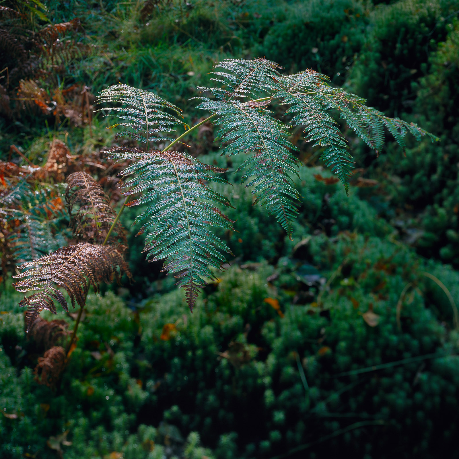
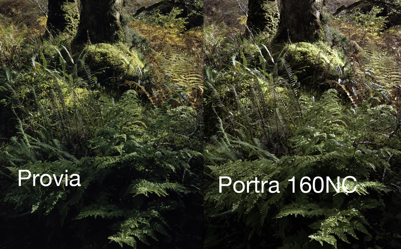
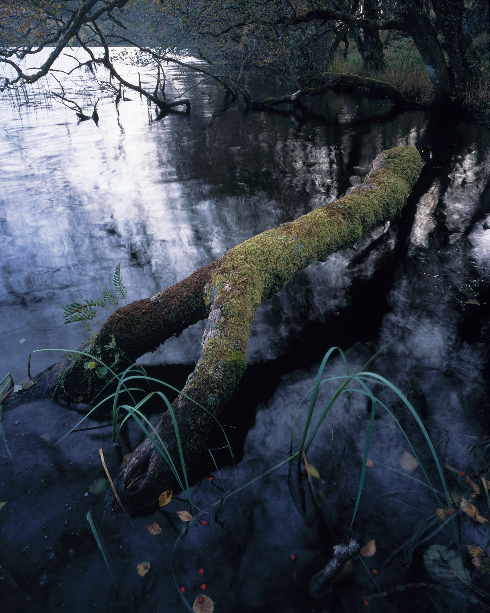
Richard was equally impressed with the place and although it was annoyingly sunny, there was still a substantial amount of material in shade or semi-shade to play with. I caught the early sun on a fern (2) and played around with narrow depth of field combined with tilt to try to emphasize the detail of the fern and the reflections of the sun. I’m still unsure about the results, I don’t think the fern stands out enough from the background (which is possibly because by the time I’d set it up, the light had illuminated the background a little too much).

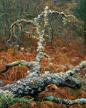
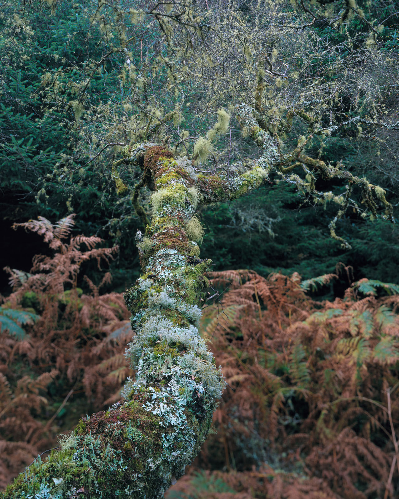
Me and Richard split up for a while, looking for compositions and I went off purposely looking for a great example of the lichens on the trees around this area. I should have realised before I did so that looking for subject matter isn’t the same as looking for photographic compositions. It is very rare that I get a great picture when I’m actually looking for some subject or other. In this particular instance, I found a suitable tree, found a nice background to take it against and worked hard to get some form of composition that would work with it. There must be something in the way we perceive things that changes when we are looking for something specific. Our mind seems to switch out of ‘abstract perception’ mode and switches into ‘cool subject’ mode. Even though I thought I’d captured a great example of what I was looking for (3), I couldn’t see the fact (or didn’t want to see) that the picture didn’t hang together compositionally. Note to self, look for compositions not subjects – in fact, possibly don’t even think about looking – actively absorb your surroundings!

Anyway – Charlotte left us ‘boy’s to play and we took a couple more pictures and then drove over to Kilberry to see what we could find.. In the end we struggled to ‘get creative’ – the light was pretty flat but we did do some interesting scouting and had a lot of fun just being out of doors. One of the highlights was just standing on the Kiberry shoreline watching the seals perform for us about 200 feet away (see picture, 4). I’ve posted previously about Richard showing me how to develop E6 film in the kitchen of our flat (my thanks got to Richard again – I’ve saved over £150 so far in developing) so we’ll skip to the next day where Richard took us to Arrochonan, a deserted township from the 17th century.

This place was awesome and although we had a dense mist, you could see down to Caol Scotnish and Loch Sween. Looking at the beautiful setting, it’s difficult to think of the hurt that the English brought to the Scottish during the clearances (admittedly because the Scottish clan leaders sold off their own tenants land). When I’m confronted with a large area like this (8 or 9 derelict stone houses distributed up the slope of a hill with an incredible view, I can’t help but want to capture the scale of the location. Each individual house is impressive but the feel of the location is all about the ‘township’. I tried for some time to work out how to acheive this and just couldn’t manage to incorporate this feeling. After a while, I backed to trying to capture the individual parts of the township, none of which were particularly successful but I’ve included a shot the main house (5) (an English built house for the Shepherd, made from the stones of some of the Scottish houses). I’ve shown a comparison of this captured on velvia and astia.

The one shot I am happy with was a detail of one of the windows in the old cottages (6). The windows were of a simplified, triangular lintel free construction (very clever) and were handily situated at the same point on either side of the cottage and when lined up, showed a loveley section of bracken and luckily, the window lined up with the top of the bracken so it wasn’t just an orange triangle. I love the simplicity of this; the beauty that human craft and nature have created giving me the perfect raw materials.

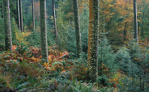
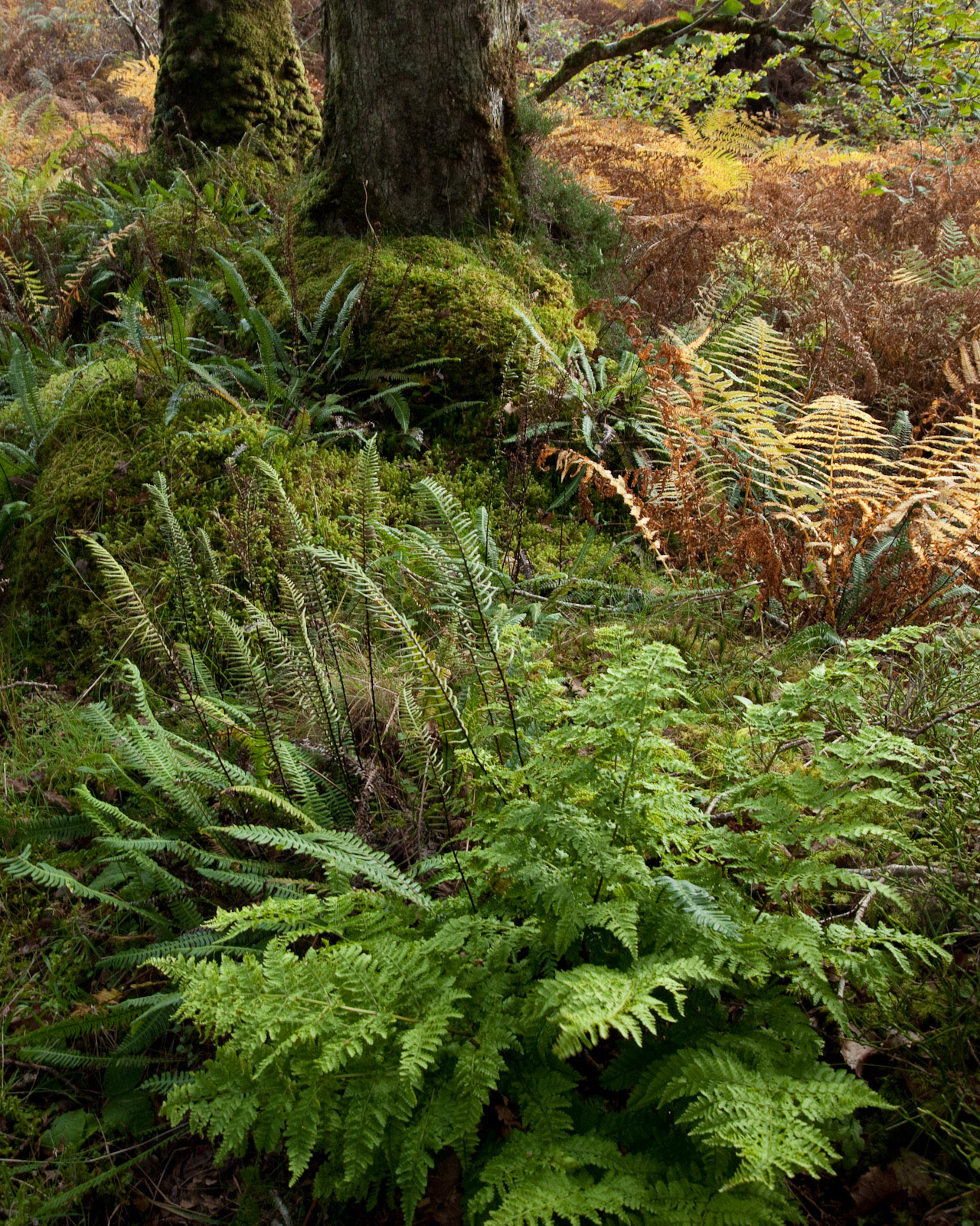
On the way back from the township, we passed the most wonderful area of open pine forest backed by birth. We stopped for a quick picture but I couldn’t resist returning the next day to investigate further and, luckily, the light was good; luminous even. The previous day we had some form of strange green light (both me and Richard got results that had a significant green cast over them) but the next day the light was translucent, even if it was still incredibly humid.

I took 12 sheets of film around this one area, the best two I’ve included on the right hand side. Taking pictures in woodland is difficult but there are a few ways to aid visualisation when doing so. The first, and most important, is to close one eye… second is to open your eye again before you start walking around (can be very embarrasing otherwise). What closing one eye does is remove any of the 3D shapes you can see, collapsing the scene into the two dimensions that you will see on paper. When you’ve found a potential composition. Try and remain still for a while (movement gives you a lot of information of the third dimension that can create shapes that won’t exist in a photograph). A few of ‘friends’ when you are working in the woods are fog, rain, dark backgrounds and low depth of field. All of these are trying to simlify the background so that you don’t get the an overly complex ‘mess’ of branches, etc. (Unless you actually want this complexity – which is a possibility, see Mr Porter)

My three composition reflect very different views of the small patch of forest I was in (I only moved my camera about 20 yards in between them).

The first (7) is a straight on portrait shot taken at the last minute (“it will only take five minutes! Honest Charlotte!”) and literally jumped out at me. The contrast of the bracken against the deep green of the forest behind was wonderful. With added interest in the small fir tree and the small patch of red bracken showing through in the very background, not to mention the limning of the tree in a bright pastel green, this had the quick impact and the longer lasting detail to keep attention. The only post processing here was to tone down the highlights along the stalks of the bracken in the foreground left area.

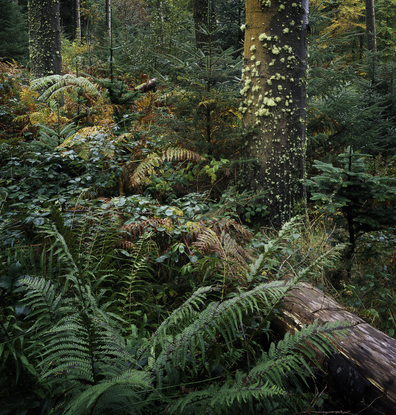
The second (8) is what might be called a group portrait; An almost formal arrangement of sparesely populated forest where each tree has it’s own space, all set against a backdrop of fir and well-turned beech. The ground was a wonderful colour-blast mix of all shades of bracken, blue green newly grown fir and cyanic green bracken. It’s the single tree in the foreground with the orange lichen that is the feature of the photograph though. I set it so close as to almost be unconfortable, it’s almost the gang leader of this group of trees.

The final picture (9) is one I’m not sure about again. I like it but the composition doesn’t feel balanced to me, it seems twisted somehow, some way I can’t quite put my finger on. I like the look of it at first glance but as I look longer it doesn’t hold together. Any comments on this one?

Click to view full post including 6 Comments
system asset 1

system asset 2

system asset 3

system asset 4

system asset 5

system asset 6

system asset 7

system asset 8

system asset 9

Tuesday
17 November 2009
9 Comments

Knapdale with Family

The forestry commission guides made a big thing of Taynish, near Tayvalich as a great destination for old growth forest and with a large moor topped hill it provided a little interest in being able to see across to Rhum. Up on top of Barr Mhor and the wind picked up surprisingly. With nothing shielding the Atlantic weather, the top of the hills around Knapdale can be bleak indeed. We dropped down at the north side of Barr Mhor down some incredibly steep rock steps (you have to admire the people who made the path through here, all volunteer effor too) and found a tremendous area of sheltered old growth oak woods. The below taken just as a cloud was starting to pass over the sun. Although I compensated for bellows factor, the shadows have dropped almost to black (although a drum scan may save something). I’ve included a picture taken with Portra 160NC and converted in ColorNeg for comparison. I’ve clipped the blacks on the Portra as there was a lot of shadow detail available that I didn’t want. I had made the mistake of thinking that the range of neg material was the same above and below and hence that I probably had +4stop and -4stops. in actual fact, I reckon that it’s more like +2.5 stops and -5.5stops. I’ve since spoken to Mike Stacey who says he rates Portra 160 NC at 100 and exposes highlights at +2 or possibly higher.. (in short, this is probably a stop over exposed). Interestingly, the Portra is damned sharp, at least as much detail as the transparency film, if not more. I’ll be playing with Portra more and will post about how best to scan and convert..

system asset

Me and my dad stopped by at Barluasgan on the way back so that I could finish off my ‘levitating branch’ shot. I brought my new waders as I guessed I would end up standing in the loch at some point in order to get the right angle. I’m using stocking foot fishing waders which although fully waterproof, are surprisingly comfortable ( if you get a decent pair). Mine are a pair of Scierra breathable waist waders in which I’ve comfortably hiked a couple of miles. Coupled with a pair of Korkers guide wading boots, they make a very comfortable wading (or just kneeling down in crap) setup in which you can very easily walk four or five miles in comfort even in late summer (I walked the last part of Skye with these waders pulled over a pair of jeans).

It was a good job I did as the angle I really wanted involved wading out thigh deep about ten foot away from the bank. Taking pictures in such a location under tree cover at dusk in Scotland is a recipe for a midge mauling but I’d come prepared again with some Avon Skin So Soft Bug Guard. The original story about Avon moisturiser stopping midges biting is true to a certain extent (in that you have to have a 1mm thick coating over your skin to acheive the effect) but has since been disproven by the US FDA during trials of Avon’s newly formulated anti insect cream called Bug Guard. This takes the component of the moisturiser that did have some little effect, concentrated it and combined it with an insect repellant which is a LOT nicer than DEET – and one that doesn’t melt plastic (they actually have two brands with two different repellants). I’ve got some spray stuff and some towelettes and they also do a combined repellant and sun block – very handy. My dad being my dad though just said “Insects don’t bite me” and so I carried on taking my pictures.

The picture is one of the first ones that has got me really excited for a while; I could immediatly see the potential but the composition I had thought about yesterday where I had included the horizon was just a little too complex for such a great subject. Any distractions from the log itself would detract from the abstract, natural illusion of the log. I took one composition with a wider lens to create the photograph I was imagining the day before but then used my 110XL to get right into the subject and line the log itself up with the dark reflection, drawing the eye to and accentuating the dead end of the log. Meanwhile my dad was looking slightly flustered by the midges that weren’t biting him and so once I’d passed my dark cloth and meter to him, I withdrew for the evening, wondering just what I had captured.

p.s. Just for the record, the midges didn’t leave a line of bites along my dads forehead and definitely hadn’t caused him to moan about them for the next couple of days.. :-)

UPDATE: I’ve added a Portra vs Provia comparison for the levitating branch picture.. The raw portra picture (as ‘auto colord’ in ColorNeg) is on the right and the raw provia is on the left. The Portra balances up very niceley though and renders great colours and ones with an especially rich red/orange flavour.. I’m starting to like Portra now I know what to do with it :-) Click for a bigger view..

system asset

Click to view full post including 9 Comments

system asset

system asset

system asset

system asset

Sunday
15 November 2009
8 Comments

Book Review : Color of Wildness, Eliot Porter

“Photography to me is a creative art. It is not simply an illustrative or interpretive medium. An artist creates according to his deepest feeling – his emotional inspiration. He cannot evoke these feelings, together with their fulfilment in an objective work, on order. It has to come from within himself… I try, not always with success, to photograph only what stimulates a recognition of beauty, either that which is intrinsic in the objects of nature or is a manifestation of the wonderful relationships of things in the natural world.”Eliot Porter

Eliot Porter may not be the first person to photograph the landscape in colour but he is certainly the first person to make a significant impact doing so. Eliot’s first accomplishment was to have a black and white show presented at Alfred Steiglitz’s Manhattan exhibition room. With the only two other people to have been selected by Steiglitz for this honour being Paul Strand and Ansel Adams, we can see why there was an enormous interest in Eliot for the start. He wasn’t even a photographer at the time although his bacteriolgist career quickly took a back seat as his black and white bird word was rejected for publication with the suggestion that he try colour. Eliot then went on to create a book of bird photography taken with a 4×5 camera!

This book covers the journey from these auspicious beginnings through Eliot’s travels around the world, taking in China, Greece, Antartica and the Galapagos along the way. Throughout the book, extra large colour plates are included of his most significant and most interesting works with occasional dips into documentary and architecture.

For me, Eliot’s vision is still as fresh now as it was when he first created the foundations upon which colour wildlife and, more importantly, landscape photography are based. He is in many ways the landscape photographer’s landscape photographer. In his work you can see the germs of ideas that are now in common usage; colours reflections on flowing water, the use of weather conditions in affecting how colour is distributed through the landscape. In many ways, he is the photographers Cezanne, a master of colour and an experimental scientist at heart.

I’ve included a couple of pictures from the book that show a part of the range of colour photography that Eliot’s work encompassed.The first picture of the yellow beech leaves against a dark blue grey granite is one that has been a mainstay of US landscape photographers ever since. The next is a shot that graced Eliot Porters masterpiece “In wildness is the preservation of the world”, where he uses reflected colour and the contrast of inky blue water with the yellow beech leaves to create what has to be one of my favourite Porter photographs. Number three is what must be the germ of a whole repertoire of work by Christopher Burkett and many other woodland photographers (including a feel not dismilar to Shinzo Maeda). The black and white trunks of the birch trees in number four contrast in a most peculiar way, almost forming a negative of itself within the picture. The red and white seaweed and blue rocks of the coastal shot show a casual composition that looks so easy until you try to acheive this effect yourself. The run of white seaweed holds the whole together like parcel tape. Finally, a picture that reflects some of Porters interest in the eastern arts. The simple, almost monotone colours of the picture, slowly receding to blues with the bulk of the rock on the left balanced by the dark greens of the forest on the right show, again, Porter’s ability to create remarkably balanced compositions that bely their initially casual nature. You can probably tell by the way I’m talking about these pictures that I’m a big fan and the prices of these books are going up all the time (mine cost me £10 but the cheapest at the moment is about £25).

Click to view full post including 8 Comments
system asset © Eliot Portersystem asset © Eliot Porter 1963system asset © Eliot Porter 1953system asset © Eliot Porter 1968system asset © Eliot Porter 1956system asset © Eliot Porter 1972system asset © Eliot Porter 1980