Kodak Ektar – The Best Negative Film, I’m Posititve
As I mentione din the last post, there have been a couple of nice bits of news for large format and film photographers recently and one of these was about a new film stock (Wow! Woop! Huzzah!) which is astonishing for many reasons, primarily just because some marketing department somewhere must have said “Well fell busines peeps, we should really address these 4×5 and 10×8 markets, we don’t want to miss out on all of that revenue and acclaim”. However, the big question is, “WHAT IS IT LIKE!!” – well, althoug the tests on the internet I’ve seen have shown that it scans very well (with as much resolution as Velvia for instance) a lot of people have asked about how it looks in comparison to Velvia, after all it is pitched as the most saturated negative film available.
Fortunately, Paul Mitchell has been taking a few example shots using his medium format camera as well as the equivalent Velvia shots. So, with a big thanks for Paul, here is my comparison.
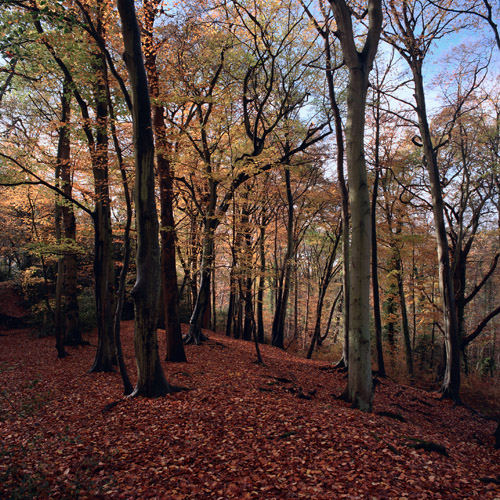
Firstly, here is the Velvia shot of some Beech woods
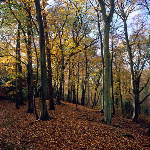
This is clearly what we would expect from a Velvia shot, warmth in the highlights, cold shadows and a wonderful separation of colour, especially in the greens to yellows (although this does look a little yellow/green to me).
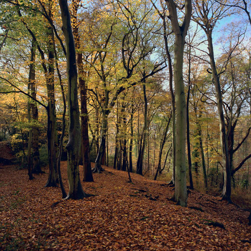
The next shot is the Ektar processed using ColorNeg with it’s default Ektar settings.
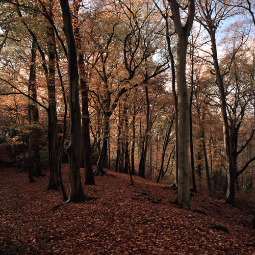
Wow! Warm indeed, this is a little bit over the top and also a little bit dull first we’ll up the saturation
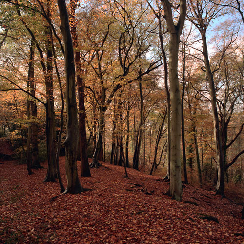
and then we’ll add a cooling filter (this is an 82 cooling filter)
This is getting better but we could still do with removing a bit of magenta to separate things. I’ve also tweaked the sky colour that got shifted a little too much when applying the cooling filter. Ektar does seems to have a cyanic quality in it’s blues that may be a bit challenging – will have to play with some more shots before I can work out just what is going on.
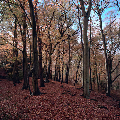
And this looks pretty good to me.. It’s got the saturation and the colour separation that transparency films such as velvia are well known for but with a nice boost in dynamic range.
Just as an experiement, lets see how if we can get it looking like velvia, just to see what happens. Firstly we need to give it more of a yellow/green cast (using a photo filter with a custom colour) and a final tweak to make things look like velvia is to cool down the shadows quite a lot (a surprising discovery whilst playing with digital and portra – more about that later).
The results are a pretty close match. Closer than I could get working on a digital file and better than I could get when working with Portra. The natural saturation from Ektar, although coming with a strong warm cast, gives the film the punch that a lot of landscape photographers love.
I must admit, I’m quite taken with it and really look forward to playing with the film in 5×4 format.
In the meantime, here is a direct comparison between my modified velvia-like version and the actual velvia version
And I’ve been asked about highlight and shadow difference – I reckon there is another 1.5 to 2 stops of dynamic range but it also seems to handle the edges of highlight detail better too.. This doesn’t mean it’s perfect, but it does make it interesting, definitely.
I should point out that these shadow and highlight detal examples are not from the ‘velviafied’ image. They are from the step before I velviated the picture (I love creating new words).
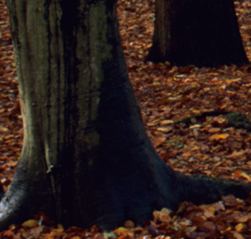
Shadow (rollover for ektar)
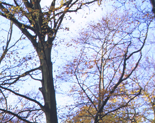
Highlight (rollover for ektar)
A few people have said in the comments that Ektar doesn’t look like Velvia and I completely agree with them. It’s a different film and has it’s own natural palette. However, It does seem to be ‘malleable’ enough to get results that are not unlike some of the punchier transparency films. I hope velvia will be around for a long time, in a lot of circumstances it’s absolutely beautiful. In other circumstances it’s a complete pain to work with. Ektar offers a new film stock that is more like what many photographers desire in a film than other negative stock and, for those photographers that can cope without the exact rendering properties of Velvia, it’s nice to know that there is another potential option.
I’m going to be playing with the film some more but I’m definitely not going to be leaving my velvia at home. (This article was never intended to try to line Ektar up as a replacement for Velvia – the main goal was to show people who are used to Velvia how Ektar differs and how ‘malleable’ it is.
Oh – I was going to mention one of the ‘discoveries’ I made whilst playing with the comparisons between velvia and ektar. One of velvia’s key features that makes it easily recognisable is it’s very cool shadows. Nearly all other films have warm or neutral shadows (e.g. Astia’s shadows tend to magenta/red) but if you examine a few velvia transparencies, you see a consistent shift to blue as you get into the denser blacks. This adds to the separation of colours in a picture as most pictures tend to be warmer in the highlights. I haven’t played with this discovery much but applying it to a few digital files had some interesting, and quite attractive, consequences
A few other links to Ektar stuff: –
27 Responses to “Kodak Ektar – The Best Negative Film, I’m Posititve”